Friday, February 29, 2008

A Day With The Gals From Ten Second Studios....

Cheryl, Megan and Geni at Ten Second Studios were so gracious to let us come spend the day with them. Annette and I were so excited when we brought this product in the store, it can be used in scrapbooks, cards and altered projects.....the possibilities are endless. Like everything else in our store, we want to be able to know everything there is so that we can help people make anything they want, so off we were to learn more. And boy did we, Cheryl spent the whole day with us teaching us EVERYTHING, we felt like we had a private teacher...well I guess we did! Their studio is filled with creative projects, I felt so inspired just being there, as you can see in the picture below Cheryl loves collecting letters of every size, shape and design. The art pieces on the wall were amazing.

THANK YOU CHERYL, MEGAN & GENIE FOR A WONDERFUL DAY AT YOUR STUDIO............
We feel like we have "cool tools for cool people now!"

Annette and I both made these frames, mine is done using the silver metal side, then we put several different paints, layering them to create this wonderful aged look. Of course I put my favorite word in there, HOT! Can you find it? After the frames Annette asked about their dog tags, Cheryl whipped one out and had us make one. I love these, they were fast easy and so much fun to wear.

Tracy Pounds, a teacher for Ten Second Studios popped in to schedule a day she could come teach this awesome class. She is coming May 17th, not sure, we may add another class with her that day too. More details and prices will come soon.


USE THOSE SUPPLIES!

I have to tell you that I probably have the best husband in the world. A few years ago I complained every day that my drive to work was too far and that I just couldn't do it anymore.

So without me even knowing, he found a wooded lot and then offered to build me a house there - cutting my drive time in half.

So we have this great house now - we have been in it nearly two years. And there are just two of us. We have so much room - it is unreal!

Upstairs on the second floor is my scrapbook studio. Mr. Wonderful installed beautiful wood cabinets and lots of workspace for me. It is just yummy.

From there, take four steps up and there are two bedrooms and a bathroom. Thus the point of my post (whew - I bet you thought we'd never get here...but here we are).

While we were having the house built, I had lots of time to plan. And one of my plans was to decorate the upstairs bathroom for each season. And so I do. And it is truly the most fun. Summer is bright and beach-themed, fall is warm browns and oranges and greens, winter is light blue and red and snowflakey. Then there's Spring. Pinks, light peach, lavender, pale green and lots of Spring flowers - oh it has it all! My Spring shower curtain is a fun collection of bright colored butterflies. Searching for the fabric for each season is a blast. ...I digress...

What I want to tell you is to bust out those scrapbooking supplies and decorate a room or part of a room in your house. The picture above is made up of two scrapbook papers, a frame and a huge flower glued to the OUTSIDE of the frame. The jar in the top picture is filled with Spring silk flowers. Not too long ago, it was filled with Autumn flowers.

Look around and you will see decorating inspiration in everyday life - and recently I've noticed that the scrapbooking companies are really picking up on the home decor side of scrapbooking. So catch up! Decorate! Use those supplies in a new and fun way.

Susie

Tuesday, February 26, 2008

Using Balance: Part 2

Asymmetrical balance (also known as informal balance) is our topic this week. Again, if we imagine our pages divided evenly in four sections, it is a little easier to work on this. The center point (where the lines meet) is the axis. The goal is to make each section around this axis equal in visual weight. Thinking about the weight of items will help us be able to balance easier as we make pages. As mentioned before, light items are less weighty or dominant than dark items; large heavier than small; patterned or heavily textured items are heavier than non patterned or non textured elements. This can also mean that a small dark item might balance out a larger item that is of a lighter color. Or a textured item of a light color will balance out an item that is darker but without texture. Putting words or thought to this process makes us more aware and will help us create a better balance on our pages.

Let's look at some examples to help us understand this process. If we look at the page in portions and fill up one half of the space with a large picture. Then, in the other half of the paper something of equal weight is placed. In the examples by Isla and Annette in this post, the larger picture is balanced by either several smaller pictures or with journaling.


It might be easier to picture the asymmetrical balance by dividing the page differently than the four equal spaces discussed above. If you think about the page in three portions and still use the same idea of similar weight you might have picture(s) in one section and very different elements in the other sections, but it all balances. Here are a couple of pages that might be easier to see if thought of in three equal columns, rather than the four portions at first. It will work on the four portions as well, but is not as easy to see right off.


Sometimes it is taking items and moving them around and around on a page before the balance becomes clearer. At this time we are only focusing on the pictures and elements on the top of the page. We're trying not to look at the way the paper is put together under it. That will come later in the series. Take a look at billboards and magazine ads this week. See if you can name the way that they acheived balance in their designs. Did they use symmetrical or asymmetrical balance. Did they balance items in an informal style by using the same colors and sizes? How did they use light and dark or textures or sizes of items to acheive balance. If you try a simple assymetrical design this week. Link your examples here if you want. We'd love to see them. Next time we will continue to explore this topic with examples and the building of a page showing the many balance factors mentioned this week.

CLASSES, CLASSES AND MORE CLASSES........

I must report that Annette's mojo is definitely back. Going to CHA was good for her and that first night her little mind was racing with ideas. One night we were at a cocktail party and I noticed her sitting against the wall sketching away. What I love about CHA is getting to try all the new stuff and learning new techniques. Since we have been back we have several classes and fun crops planned for the next couple of months, be sure and check out the events on the web site.
Caroline from Maya Road is coming to teach this adorable house and accordion album,
Saturday March 29th ONLY 2 SPOTS LEFT


Annette's Funky Spring Frame A darling wooden frame adorned with metal, paper, flowers, cardboard, and ribbon. We'll use many new techniques including the Ten Seconds Studio metal! Then, we'll top it all off by "suspending" our picture in the frame center. The colorful Daisy D's Wonder Years completes the look of fun in springtime.


Celebrate our wonderful world as you create a stunning canvas. Inspired by Louis Armstrong's "What a Wonderful World", this project will show you how to use masks, canvas, chipboard, glitter (oh, yeah!), and more. Precious!!


Sunday, February 24, 2008

I LOVE MY AD..........

I am so blessed to have a good friend who is a awesome photographer. When we were approached about a ad going into the profile addition of the Waxahachie Daily Light, Marie said "only if Carolyn goes in with me". I of course agreed only if she made my ad. I was blown away with what she came up with.....Thanks Marie! The best part was they did a feature story on Marie and she was on the cover, she deserved it, she is a great photographer!

A Fun Easter Album


Many of you may have seen this cute little Love Elsie "Zoe Pallette" album in the store and wondered, "What could I possibly use them for?" Well...Sherri, Miss Idea Queen, handed me the book and said, "This would make a great album for dying Easter Eggs." She was so right.

The first idea I had was actually for the back cover. Since these albums come with 30 pages, I thought I could do some great layering to make a dimensional cut out. I made five templates. One template for the outside rim which is just a border that is wide enough to encase the hole for the ring. The next two were tempates for grass. I used two different grass designs. I also made two designs for the sun. Each of these templates was based on the top template of the outside rim.


I traced each templates three times. I then glued the layers together using Zig two way glue. Now I have five pieces for my back page.
I used the template to trace my paper for the grass,the sun and the border and cut them out as well. I used love Elsie "Toby Go" embossed card stock for the grass. I used Pizzazill orange for the sun. The border was covered with "Zoe Candy Stripe." I glued each of these to the top of the correct layers.

I then sanded each of the layers with my Basic Grey files and inked them with my Cat Eye Chalk Inks.
I cut out a cloud from the "Toby Cloudy" paper and glued it on the back blue cover. Then I started gluing each of the layers down. I slide my cut out of Luke hunting for eggs. For some added texture, I used my Stickles to create some added sparkle to the sun. I then hid some jeweled flowers and made some homemade easter eggs that I made from "Toby" and "Zoe" papers. Then I did some outlining with dots and dashes using a black pen.

When everything was in place, I painted the outside with purple paint.

Here are the rest of the pages for the album.
I embossed an egg dipper for the front cover. I also made sure that the Maya Roads click could be seen through the hole in the front cover.
I also have some pictures of my kids with some jelly beans that I think would fabulous with this album.
I hope this inspires you. If you have any questions, I will be glad to help you out.
Brook

Monday, February 18, 2008

Using Balance in Scrapbooking

If you have ever taken any kind of art class you probably were given a list of items that make good art - meaning what would make things pleasing to the eye. Items like color planning, balance, scale, emphasis etc. As mentioned last week, we are going to start talking about some of these elements. The topic for this week is balance.

As a principle of design, balance refers to the way the elements of art are arranged or distributed. Good balance creates a feeling of stability in a work; a pleasing distribution that provides equal visual weight on a page.We have all seen balance used in decorating when someone puts two lamps on a table-one at each side.

Visual weight is determined by the color, size, texture or amount of detail of an element. Maybe another way to think of weight is with the word dominance. For example, darker objects are heavier or more dominant that lighter color items, those with more texture of pattern are more dominant than those without it, and larger items are obviously 'heavier' than small items.

Two types of balance are usually discussed-symmetrical and asymmetrical. Symmetric balance, also known as formal balance, occurs when the two sides are identical — they reflect each other, kind of like a mirror. All items are distributed equally around a central axis. In other words, if you divide your page into equally sized portions with imaginary lines horizontally and vertically you would see items equally placed on the page.

This may seem like a lot of jargon, to me balance is something that many people do innately. I also think the way that a person uses balance is specific to that person's preferences. However, even for those who are not born with a sense of balance it is sommething that a person can learn or we can all learn to do better.

Let's use real examples for this topic. A layout that has an even number of pictures put in a square is a balance almost everyone can see easily. In this example, you see that Annette used 9 squares which are lined up evenly. Although each square is not exactly the same thing as in the lamp example, these squares are evenly spaced at the same levels on the page and it provides a very symmetrical looking layout.

Here is another example of a symmetrical layout. This one is even a little more symmetrical than the first example:
<


These symmetrically balanced layouts are calming, soothing and very pleasing to the eye, aren't they. I think everyone can easily see how the page looks balanced. Try a symmetrically balanced page this week and see how it fits with your way of scrapbooking. We will talk about asymmetrical balance next week. This is what we all use the most, and it can be difficult at times to acheive such a nice balanced look to our pages using assymetry.

Sunday, February 17, 2008

All Day Crop and CHA Demo's.................

Saturday was a blast! We showed everyone the Ten Second Studio stuff, Scro-Pal, Bind-All and all the goodies from each company. Everyone received a little stamp from Pink Paislee and give-aways from Glitz, Cosmo Cricket, Daisy D's, Maya Roads and several other companies.


For lunch we tried a NEW place called "Two Sisters Boxlunch Cafe". A couple of sisters I know took the plunge and opened a cafe, I have to tell you that was the best chicken cranberry salad sandwich I ever had. Their special touch are their cupcakes, Saturdays specials were Hummingbird and Lemon cupcakes. I cannot even explain the taste....they were AWESOME! As you can see we all thought so, if you get a chance try them out, they are located in My Fathers House on Rogers Street.


Saturday, February 16, 2008

HAPPY BIRTHDAY MaryLou!

We missed MaryLou's birthday while we were in CHA, so we surprised her with cake and presents last night. One thing great about getting gifts from creative people is the uniqueness of the gift. Sherri gave MayLou the cutest bottle filled with old buttons. Annette gave her an adorable porcelain can from Melissa Frances made up with all their new product.

WE LOVE YOU MARYLOU....HAPPY BIRTHDAY!


Tuesday, February 12, 2008

Got the scraps, got the stamps...got a card.

Just another quick card. The paper is just a couple of scraps and the flower is diecut from a scrap. The rest is all stamped.

After I stamped the flowerpot onto rust colored paper, cut it out and adhered it to the card, I got out my trusty file and distressed it a bit so it looks aged. I think it gives it a more realistic look.

So when you finish your next project, take a look at your scraps and see if you can pull a card together to bless someone you know. And also be sure to always check The Crafty Scrapper blog for the latest card challenge at the store.

Susie

Some highlights from today.....

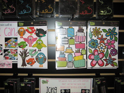
Well today was a busy day and Annette and I are trying to make everything fit in our bags without having to ship anything. I am posting a few highlights of the day. We ordered so much today and still have more to do tomorrow before we leave. Annette and I are soooo excited to be bringing in Ten Second Studios, and it will be there by Saturday. Annette and I will be demonstrating this along with the score pal and showing you guys many other goodies on Saturday.


We were hearing this buzz about these organizers so we went downstairs to find this new company. We were instantly sold on the possiblities. They are sending back with us a class kit, which we will demo on Saturday. The best part is that you can alter these organizers.


A lot of people have asked for these message recorders, well they are coming. I loved this company because of how they showed them altered and the different ways to use them.


We found a little treasure down in the new exhibitors, Pink Paislee, we loved their booth, their pink and white polka dot aprons and all their product. They were so sweet and gave us stamps for each person who is signed up for the Saturday crop. This is a "HOT" new company and we love their stuff.


This is a new company for us, Glitz. We LOVED all the bling bling, big journaling rubons, and these awesome little roller doodles. We will have some of these to demo on Saturday too.